Job Search Redesign
Finding a job is stressful enough without the added friction of scattered platforms, repetitive applications, and unclear status updates. Job seekers often juggle LinkedIn, Indeed, Glassdoor, and company portals, only to lose track of where they applied or miss follow-up deadlines. This project explores how a simplified, centralized job search and application experience can reduce frustration, save time, and give users more confidence in managing their career journey.
Project Overview
CHALLANGE
Job seekers often struggle with fragmented experiences when applying to roles across different platforms. Current job search tools lack centralized tracking, provide overwhelming or irrelevant notifications, and force users to repeat manual tasks across multiple portals. This results in wasted time, frustration, and missed opportunities.
SOLUTION
Design a streamlined job application and tracking platform that simplifies search with better filters, provides a unified dashboard for managing applications, and delivers personalized notifications. The goal is to reduce cognitive load, improve efficiency, and empower users to stay in control of their job search process.
ROLE
UX, UI Designer
TIMEFRAME
4 weeks
Design and deliver a job search and application platform by conducting research, defining personas and flows, creating prototypes, testing with users, and finalizing UI documentation.
TASKS
Figma
Notion
Canva
AI tools
Asset generating
TOOLS
EMPATHIZE - Understanding users and their needs
Research
Through market analysis, competitor comparisons, and user-focused surveys, I set out to gain a deeper understanding of the modern job‑search landscape. This research examines market trends, candidate behaviours, and the tools and platforms job seekers use today.
Research Goals
Understand trends in the online job market, including the adoption of applicant tracking systems (ATS) and artificial intelligence.
Identify target user groups (entry‑level, mid‑career, freelance) and their primary needs when searching for jobs.
Evaluate key job‑search platform (LinkedIn, Indeed, Glassdoor) to highlight strengths and weaknesses.
Understand how candidates discover jobs (job boards, social media, company sites) and research potential employers.
Identify pain points in the application process, such as complexity, lack of feedback, and time requirements.
Examine candidate preferences for transparency (salary, benefits), remote/hybrid work, and communication speed.
Market research
therefore…
Job seekers in 2025 report low confidence and extended job hunts even though most hold degrees and are actively upskilling.
Employers use applicant‑tracking systems extensively, filtering many résumés before human review, while candidates are leveraging AI and multiple search channels, with LinkedIn and job boards leading the way.
Candidates criticise application forms as too long and complicated, cite inconsistent communication, and prioritise salary transparency and flexible work options.
Burnout is common and many applicants research employer reputation thoroughly before applying, with negative perceptions leading to declined offers
Competitive Analysis
To create a compelling job‑search and tracking platform, it is essential to understand the current market and the tools already available.
This analysis reviews mainstream job boards, specialized job‑application trackers and emerging AI‑powered tools.
For each competitor, we highlight strengths and weaknesses based on recent research, allowing us to pinpoint gaps that our solution can address.
User Interviews
Interview Objectives
To inform our design, we set clear research goals:
👉🏻 we wanted to understand how job seekers currently manage their applications, the pain points they encounter, and their expectations for a unified platform.
According to UX research best practices, effective interviews start with a focused set of questions that align with these goals, avoiding overly broad objectives.
Participants & Method
We interviewed four participants:
a recent graduate seeking a first job,
a mid‑level UX designer,
a freelance designer juggling multiple projects,
a senior professional changing industries.
Following established guidelines, we prepared a semi‑structured interview guide with open‑ended questions such as “Tell me about the last time you applied for a job” and used follow‑ups like “How did you feel?” to elicit deeper insights.
We piloted the guide with a colleague to refine our questions before the sessions.
Key Insights ❌
Long, repetitive applications 👉🏻 Entering the same information across multiple long forms
Manual tracking & lack of updates 👉🏻 Using spreadsheets to track applications; rare employer feedback.
No salary transparency 👉🏻 Desire for clear pay details in job postings.
Fatigue & burnout 👉🏻 Job search feels like a second job; exhaustion.
Design Impact ✅
These insights directly influenced our product decisions.
We can prioritize a streamlined application process that reduces redundant data entry, integrate a dashboard to track applications at a glance, and ensured salary information is prominently displayed.
👉🏻 By addressing the lack of feedback and the emotional toll of job hunting, our design aims to make the search experience more transparent, efficient, and humane.
User Persona
Through secondary and primary research, I gained a clear picture of our target users and distilled their needs into a single, representative persona: meet Susanna Johnson.
This persona has guided every design decision since, keeping our focus on the specific frustrations and goals of job seekers like Susanna and ensuring that our solution directly addresses challenges such as repetitive applications, manual tracking, limited feedback, and the desire for transparent compensation.
DEFINE - Clarifying the core user problem
Problem Statement:
👉🏻 Job seekers struggle to stay organized and motivated throughout the application process, often losing track of opportunities and feedback due to fragmented tools and lack of visibility.
This led me to ask:
How might we make job searching more efficient and transparent for users?
IDEATE - Exploring possible solutions
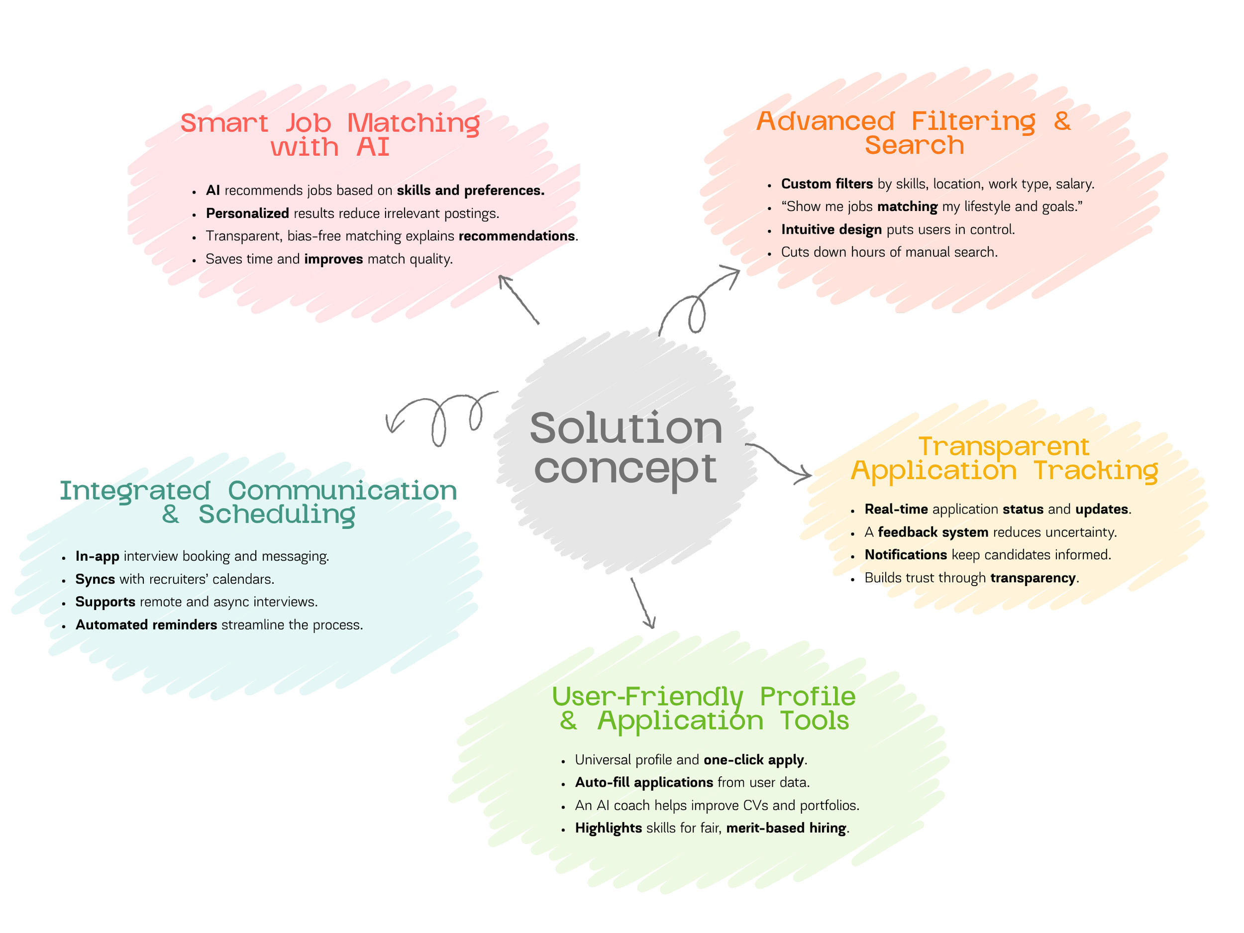
This solution concept map visually organizes how our recruitment platform addresses each user pain point uncovered in research.
By mapping the main features and their purposes, we can clearly show the logic behind our design:
👉🏻 every idea connects directly to a real user frustration such as repetitive applications, lack of feedback, or irrelevant job results.
The concept map bridges the gap between user insights and design strategy, proving that every design decision is grounded in empathy and data, not assumptions.
IDEATE - Wireframing
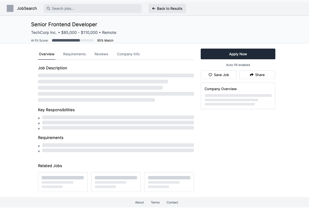
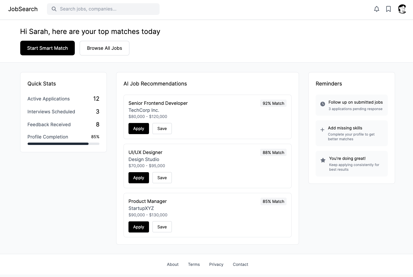
At this stage, I translated the main user flows into mid-fidelity wireframes to define the structure, layout, and core interactions of the platform.
These screens focus on usability and hierarchy rather than visual style, allowing me to validate the logic behind each page before moving into high-fidelity design.
The goal was to ensure that every element supports the user’s need, simplifying navigation, improving visibility, and creating a clear, motivating experience across all key touchpoints.
Homepage / Onboarding Page
Job Details Page
Application Tracker Page
Starting to build the High Fidelity prototype in Figma
Dashboard Homepage Login Page
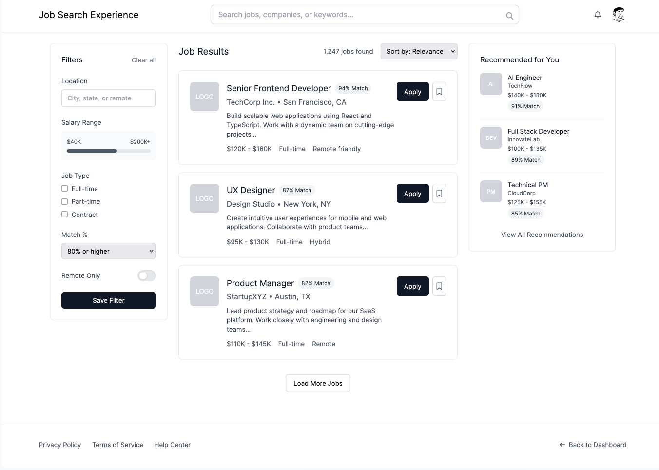
Job search result Page

Application Form Page.
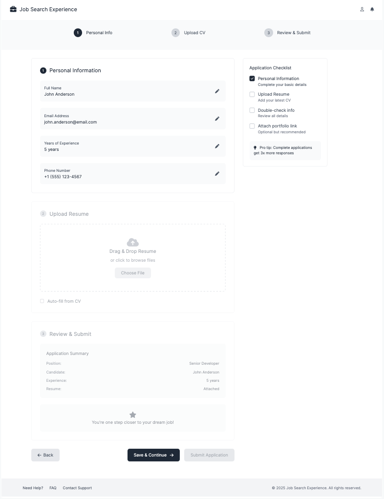
Feedback & Growth Page

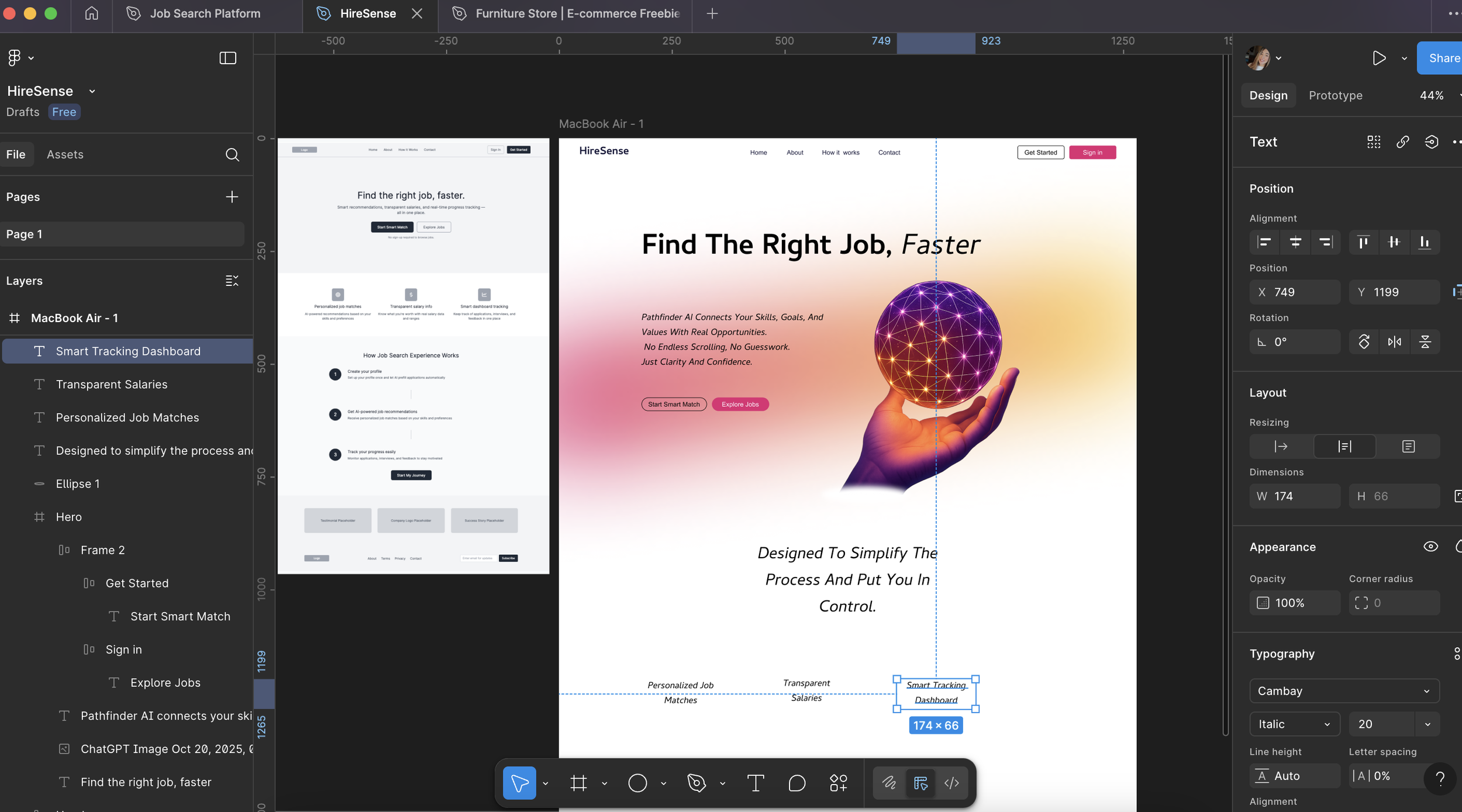
Case study in progress
